Building your Dashboard with Jet Report
Most of us are familiar with dashboards which help give visuals and insight into our Report for better understanding. Building a dashboard with Jet Report is entirely different from creating a dashboard from Excel Data. Creating a dashboard with Jet Report is done in design mode, this allows you to make any adjustment to your dashboard directly from the data. Any changes made to your report reflect directly on your dashboard. This tutorial shows you how to Build your Dashboard with Jet Report from an income statement.
We will create our dashboard from one of the reports we’ve created.
Step 1. Open the Report you’ll like to use in creating your dashboard.
Open your Report and make sure to be in Design Mode, this is very important. just as the data are copied in Excel. In Jet, the data are copied in design mode.
Note: any changes you want to make to your report should be done in the design mode. this way, it will affect your report.
Step 2 Highlight the data you want to build your dashboard with.
Select and highlight the data you want to build your report with just as shown below. you must be wondering why we select the empty rows beneath the report. that is necessary because we are in design mode and we still need to run the report to get our full data. selecting the empty rows (or columns if the report is based on “NL(column)”) automatically expands the data as the jet runs.
Step 3: Get the data into your pivot table.
Click on the “insert” in the ribbon, you should be able to see Pivot Table at the top left corner as shown below.
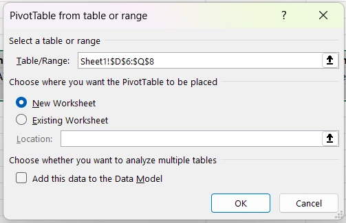
Once you click on the “Pivot Table“, there will be a pop-out where it will ask you if you want to place the Pivot Table in a New Worksheet or Existing Worksheet. Select New Worksheet and click ok.
Excel will automatically open a new Worksheet for you where we can have access to all the data in our report. the sheet should look like what is shown below. You can then double-tap on the name to change it. we changed our Pivot Table “sheet” to Data and Our “Report page” to Report.
Step 5: inputting the data into the Pivot Table
Before you input your data into the Pivot Table, ensure you’ve run our report to access the full data, as shown below.
Now, navigate to the data sheet where we have our Pivot Table. we want to view our Monthly variance by account categories.
we click or drag the “Account Categories“ to Rows
we click or drag the Monthly Variance to Values as shown.
Step 6 Building your Dashboard
Now that we have our data in the Pivot Table, we select a pivot chart to help give better insight into our data.
to do that,
navigate to PivotTable Analyze
Click on PivotChart
on the page that pops out, select any chart of your choice.
click on okStep 6 Building your Dashboard
Now that we have our data in the Pivot Table, we select a pivot chart to help give better insight into our data.
to do that,
navigate to PivotTable Analyze
Click on PivotChart
on the page that pops out, select any chart of your choice.
click on ok
When you click on ok, you will have your chart on the same sheet as your pivot table as shown below.
Step 7: Create a new sheet for our Chart.
Click on the positive icon to create a new sheet
Rename the sheet to Dashboard
Click on the chart to cut and paste it into the dashboard sheet.
Navigate to “View” and click on it
Un-select gridlines to have a plain sheet as shown
Then cut and paste your Chart here.
Anytime you run your report with a different filter, it will automatically reflect on your Dashboard.


