Create a Star/Snowflake Schema and DAX measures in Excel
- Abdulazeez Abdullah

- Feb 13, 2023
- 3 min read

You are not wrong if you call PowerBI an upgraded Excel. The major components of PowerBI are Power Query, Power Pivot and Power View. Power Query is used for ETL purposes while Power Pivot is used to establish a relationship between the tables and Power View aids the visualization.
Little did you know that these components also exist from Excel-2010. Safe to say underrate Excel at your own peril.
Two things we would be going through are;
Create a data model
Write DAX measures
Data used can be downloaded here.
To create the date table, the following M codes were used. Download here.

In order to add the date table, power query was used. To do this, Go to the Data tab and select Get data > From Other Sources > Blank Query

Note: I’m using Office 365
On selecting Blank Query, the Power Query window shows. Then click Advanced Editor.

The M code here was then pasted

Next was to include the start and end date.

Did a close and Load and we have our calendar table.

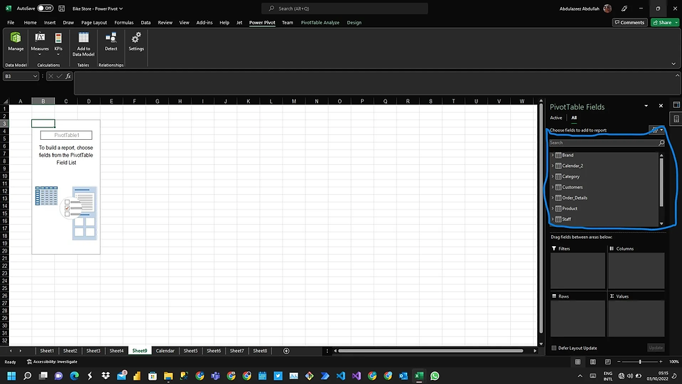
The data model contains 9 tables including the Calendar table. How then do we establish relationships between these tables?

Here comes Power Pivot with the solution.

If you don’t have Power Pivot enabled, here’s a quick guide on how to go about it.
While your Excel is open, Select File > Options

Select Add-ins.

At the bottom, where we have Manage. Click the Dropdown and select COM Add-ins.

Ensure Power Pivot is ticked and then select Ok. Power Pivot will be added to your excel.

Create Data Model
Let’s go back to establishing relationships between the tables. To add tables to the data model, select any cell within your table and then click on Add to Data Model.

Once done, the power pivot window comes up as seen in the image below indicating that a particular table has been added. Close the window and repeat this step for subsequent tables.

All tables have been added.

Select Diagram View to link the tables together.

See the tables in diagram mode

Note that the essence of this article is not to speak on what data models are. All that is left is to drag and drop related columns on each other and we have an established model.

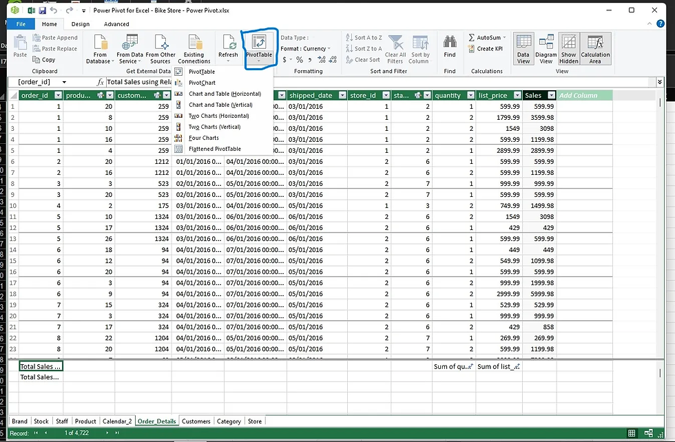
In order to be able to use your data model for analysis, click on the Pivot table in Power Pivot. It gives you several options, you can create pivot tables, single/multiple charts

Let’s go for a Pivot table. On selecting that, Our model gets loaded while retaining relationships between the tables.
Let’s run a test and see the outcome. The image below is a table containing variables from 3 different tables. Year from the calendar table, category name from the category table and quantity from the order details table.

Simple and straightforward right? Nothing complicated

DAX Measures
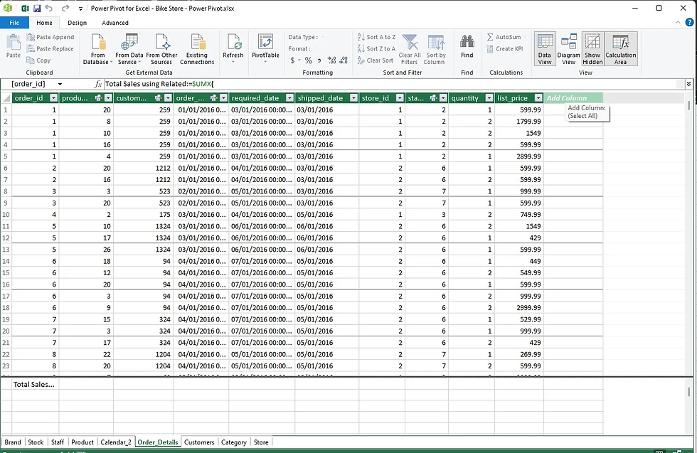
The beauty of establishing a relationship is that, rather than using generic columns, you can still write DAX measures that use the relationships between the tables.
To do this, select Measure > New measure

On selecting, you have the dialogue box below. Input the details.


Note that total sales were created in two ways. This was done just to show that relationships created in excel work fine with DAX as both measures will return the same output.
Let’s do one more thing. Create a sales column in the order details without using DAX and we check if they all return the same values. Exciting, Yeah!!!

To add this column, select the manage icon

This takes you back to the Power Pivot Window. Select Data View.

Click on the Add column
Type in your column name and the sales formula in the cell below

Load the model by clicking on Pivot Table once more.
Now we have sales calculated in 3 different ways. Let’s see if the output will remain the same.

From the image above, we can see that the outcome remained the same irrespective of whatever approach we took in calculating sales.
You can even write a CALCULATE function. The same DAX that works in PowerBI also works here.

The output below

You can even write variables

The output is below. Punch your calculator and see if the YOY growth is accurate.

Excel is a very amazing tool and it is now way more than what it used to be. Like a said, underrate excel at your own peril.
I hope you have been able to pick up one or two things. See you next time.


Comments